
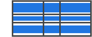
Grid 布局是 CSS 中最强大的布局方式。它是一个二维系统,也就是说,它能同时处理行和列,而不像 flexbox 这样是一个一维系统。使用 Grid 布局方式可以同时将 CSS 规则作用于父元素(成为 Grid Container)和子元素(成为 Grid Items)。
介绍
CSS Grid Layout(又叫做 Grid),是一个二维的、基于网格的布局系统,目标是完全改变我们基于网格设计的用户界面。CSS 已经常用于 web 页面的布局,但并不是总做得非常好。开始,我们使用表格 tables 布局,然后使用浮动 floats,定位 position 和 inline-block,但说到底,这些方法都算作 hacks,漏掉了一些重要的功能性(比如垂直剧中)。Flexbox 可以解决问题,但是它是为简单的一维布局而设计的,并不是为复杂的二维布局而设计(Flexobox 和 Grid 事实上可以同时工作)。Grid 是最开始为解决布局问题而创造出来的 CSS 模块。
写这篇指南出于两个基本原因:一是 Rachel Andrew 写佳作 Get Ready for CSS Grid Layout,它是一本清楚而透彻介绍 Grid 的书,也是本文的基础所在,我高度建议大家买来读一下。另一个原因是 Chris Coyier 的 A Complete Guide to Flexbox,它是我定位 flexbox 问题的随手工具书,它同时也帮助了一大批的人,你在 Google “flexbox” 的时候,它也出现在明显位置。你可以注意到他和我文章的很多相似之处,因为有最好的,为啥不借用?
我写这个指南主要目的是介绍 Grid 的概念,因为它已经出现在了最新版的规范里。所以我也不会涵盖到已过时的 IE 浏览器,并且当规范成熟时,尽量更新这份指南。
基础知识
要开始使用 Grid,首先要定义一个容器元素,使用 display: grid,然后设置列和行的尺寸,使用 grid-template-column 和 grid-template-rows,接着用 grid-column 和 grid-row 安置它的子元素。与 flexbox 类似,代码出现的顺序与 grid items 的排列没有关系。CSS 代码层面可以用任何顺序来写,而且使用媒体查询可以很容易地把 grid 重排。想象一下把整个页面都布局好,然后用几行 CSS 代码将它完全重排以适应不同的屏幕宽度。Grid 是迄今介绍过的最强大的 CSS 模块。
重要术语
深入 Grid 概念之前有些重要术语需要知道。因为这里包含的规则概念上相似,所以如果不先记住 Grid 规范中定义的术语,很容易在使用的时候相互混淆。不过不用担心,因为术语没有很多。
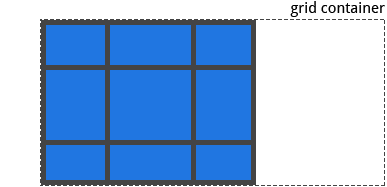
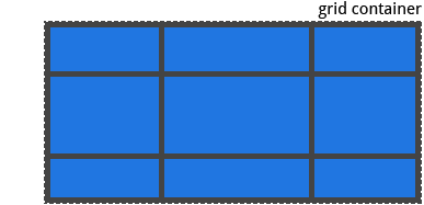
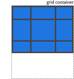
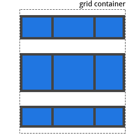
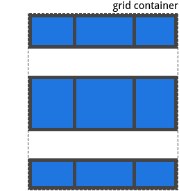
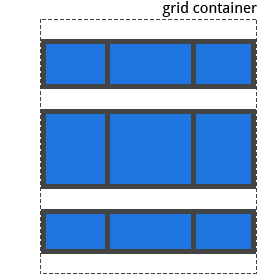
Grid Container
使用了 display: grid 的元素即为 Grid Container。它是所有 grid items 的直接父元素。在下面这个例子中,container 就是 grid container。
1 | <div class="container"> |
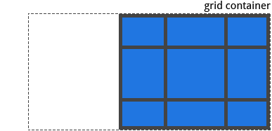
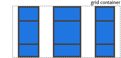
Grid Item
Grid Container 元素的直接子元素。下面的例子中,item 元素就是 grid items,但是 sub-item 元素不是。
1 | <div class="container"> |
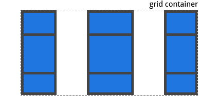
Grid Line
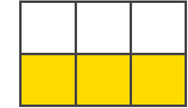
这些分割线组成了 grid 的结构。它们可以是垂直的(column grid lines)或者水平的(row grid lines),或者位于 row 或 column 的两侧。图示的黄线就是一个 column grid line。

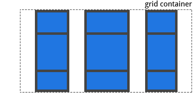
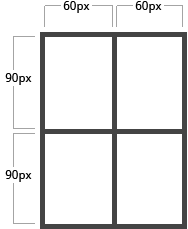
Grid Track
位于两条 grid line 之间的空间。可以想像成 grid 里的列或者行。
Grid Cell
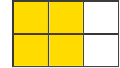
位于两相邻行和两相邻列的 grid lines 之间的空间。它是 grid 布局里面的“单元”。图示中是行的 grid lines 1 和 2,以及列的 grid lines 2 和 3 之间的 grid cell。

Grid Area
被四条 grid lines 包围的总体空间就是 Grid Area。一个 grid area 可以由任意个数的 grid cells 组成。图示中是 1 和 3 行 grid lines 以及 1 和 3 列 grid lines 包围而成的 grid area。
Grid 属性表
用于 Grid Container 的属性(即父元素的属性)
display
把元素定义为 grid container 从而为它的内容形成一个新的 grid formatting context。
值:
- grid - 产生一个块级的 grid
- inline-grid - 产生一个内联级的 grid
1 | .container { |
Note: The ability to pass grid parameters down through nested elements (aka subgrids) has been moved to level 2 of the CSS Grid specification. Here’s a quick explanation.
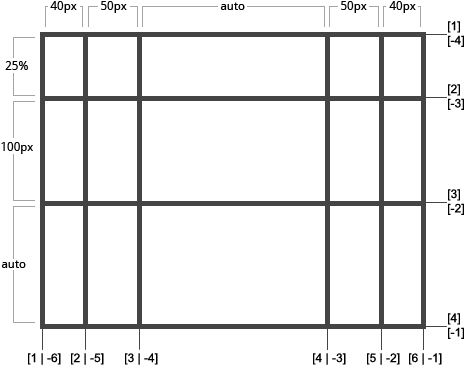
grid-template-columns 和 grid-template-rows
定义列和行,使用空格将这些属性值连起来。这些值包含了 track size,它们之间的空间代表的是 grid line。
值:
- <track-size> - 可以取长度、百分比、grid 中空白空间的一部分(使用
fr单元) - <line-name> - 可以取任意名字
1 | .container { |
例子:
当在 track 的值上留空时,grid lines 会自己分配正值或负值:
1 | .container { |
也可以为这些 lines 指一个固定的名字,注意一下 line 名的括号语法:
1 | .container { |
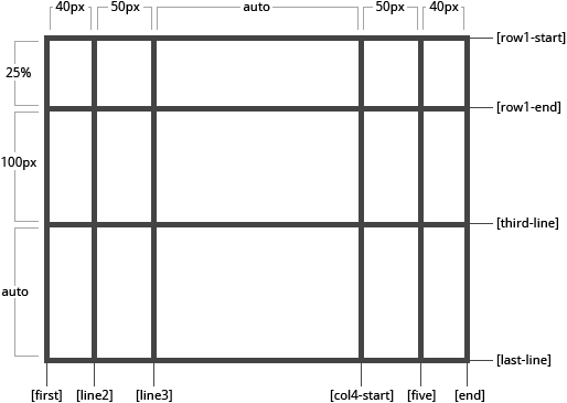
要注意的是,一条 line 可以拥有不止一个名字。例如,第二条 line 拥有两个名字:row1-end 和 row2-start:
1 | .container { |
如果定义的时候有重复部分,那么可以直接使用 repeat() 记号进行组织:
1 | .container { |
它等价于:
1 | .container { |
如果多个 lines 使用相同的名字,它们会参照 line name 和计数。
1 | .item { |
fr 单元允许你使用 gird container 中的空白空间去设置 track 的尺寸。例如,下面的代码会将每个 item 的宽度设置为 grid container 宽的 1/3。
1 | .container { |
空白空间是去除固定 item 之后的值来计算的。下面的例子表示,用于 fr 来表示的空白空间,不包括这 50px。
1 | .container { |
grid-template-areas
先用 grid-area 属性来定义 grid areas 的名字,之后参照这些名字来定义 grid template。Repeating the name of a grid area causes the content to span those cells. 一个点号 . 表示一个空的 cell。语法的本身就提供了 gird 视觉化的结构。
值:
- <grid-area-name> - 使用
grid-area指定的 grid area 的名字 - . - 空 grid cell
- none - 没有 grid areas 被定义
1 | .container { |
例如:
1 | .item-a { |
这段代码产生了一个四列宽度三行高的 grid 。整个的顶部行都会组成 header 区。中间的行会组成 main 区,一个空白 cell,一个 sidebar 区。最后一行全部组成 footer。
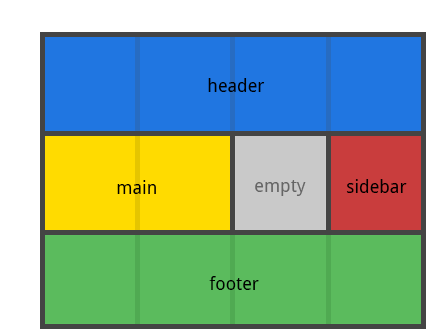
声明中的每一行,必须有相同的 cell 数目。
可以使用任意数量的点号来指定单个空白的 cell。只要点号之间没有其他的空白,那么它们就会组成一个空白 cell。
要注意不能使用这个语法来命名 lines,只能用它来命名 areas。当使用它来命名 areas 的时候,area 两边的 lines 会被自动命名的。如果你的 grid area 的名字是 foo,那么这个 area 的起始 row line 和起始 column line 就会被命名为 foo-start,并且最后一个 row line 和最后一个 column line 会被命名为 foo-end。这就意味着,一些 lines 会有多个命名,比如上个例子中最左边的 line,它就拥有三个名字:header-start,main-start 和 footer-start。
grid-template
这个属性就是 grid-template-rows,grid-template-columns,grid-template-areas 三个属性的缩写。
值:
- none - 表示设置为三个属性的初始值
- <grid-template-rows> / <grid-template-columns> - 将
grid-template-columns和grid-template-rows分别设置为指定的值,而将grid-template-area设置为none。
1 | .container { |
它同时也接受,看起来复杂,但是用起来很方便的语法同时指定三个属性,例如:
1 | .container { |
等价于:
1 | .container { |
grid-template 并不会重设一些暗藏的属性(比如 grid-auto-columns,grid-auto-rows 和 grid-auto-flow),但往往在很多情况下这是想要进行的设置,所以建议使用 grid 属性来代替 grid-template。
grid-column-gap 和 grid-row-gap
用来指定 grid lines 的尺寸。可以想象成设置 column / rows 之间的沟槽的宽度。
值:
- <line-size> - 长度
1 | .container { |
例子:
1 | .container { |
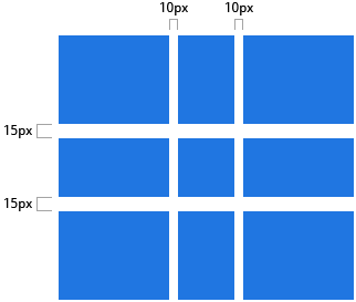
沟槽仅会在 columns / rows 之间产生,不会在外边界产生。
注意:grid- 这个前缀将会被移除,到时 grid-column-gap 和 grid-row-gap 会被重命名为 column-gap 和 row-gap。无前缀属性现已经被 Chrome 68+,Safari 11.2 Release 50+ 和 Opera 54+ 所支持。
grid-gap
grid-row-gap 和 grid-column-gap 的缩写形式
值:
- <grid-row-gap> <grid-column-gap> - 长度
1 | .container { |
例子:
1 | .container { |
如果没有设置 grid-row-gap,那么它会被设置为与 grid-column-gap 相同的值。
注意:grid- 这个前缀将会被移除,到时 grid-gap 会被重命名为 gap。无前缀版属性现已经被 Chrome 68+,Safari 11.2 Release 50+ 和 Opera 54+ 所支持。
justify-items
让 grid items 沿着内联轴(row)对齐(与 align-items 沿着块级轴(column) 相反)。这个属性会对 container 里所有的 grid items 都生效。
值:
- start - 将 items 与 cell 的起始边缘对齐
- end - 将 items 与 cell 的结束边缘对齐
- center - 所有 items 在它们的 cell 里水平居中
- stretch - 填满整个 cell 的宽度(默认值)
1 | .container { |
例子:
1 | .container { |
1 | .container { |
1 | .container { |
1 | .container { |
这些表现,也要以在单独的 grid items 上通过 justify-self 属性各自设置。
align-items
将 grid items 沿着块级轴(column)对齐(与 justify-items 沿着内联轴(row) 相反)。这个属性同样会对 container 里所有的 grid items 都生效。
值:
- start - 将 items 与 cell 的起始边缘对齐
- end - 将 items 与 cell 的结束边缘对齐
- center - 所有 items 在它们的 cell 里垂直居中
- stretch - 填满整个 cell 的高度(默认值)
例子:
1 | .container { |
1 | .container { |
1 | .container { |
1 | .container { |

这些表现,也要以在单独的 grid items 上通过 align-self 属性各自设置。
place-items
place-items 是 align-items 和 justify-items 和缩写方式。
值:
- <align-items> / <justify-items> - 第一个值设置
align-items,第二个值设置justify-items。如果第二个值被省略,那么第一个值则同时用于两个属性。
除了 Edge 之外的所有主流浏览器都支持 place-items 的简写方式。
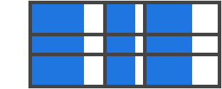
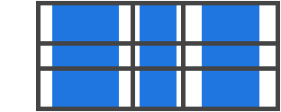
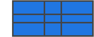
justify-content
有时所有的 grid 的尺寸之后可能还是小于 grid container,这常发生在指定 grid items 的尺寸的时候,用的是 px 这样的固定单位。在这种情况下,可以设置 grid 在 grid container 里面的对齐方式。这个属性将 grid items 沿着内联轴(row)进行对齐(与 align-content 相反,align-content 是沿着块级轴(column)对齐)。
值:
- start - 将 grid 沿着 grid container 的起始边缘对齐
- end - 将 grid 沿着 grid container 的结束边缘对齐
- center - 将 grid 在 grid container 水平居中
- stretch - 调整 grid items 的大小让 grid 去填满 grid container 的宽度
- space-around - 在每个 grid item 旁设置偶数个空间,起始端和尾端的空间宽度为其他的半数
- space-between - 在每个 grid item 旁设置偶数个空间,起始端和尾端不留空间
- space-evenly - 在每个 grid item 旁设置偶数个空间,包括起始端和尾端
1 | .container { |
例子:
1 | .container { |
1 | .container { |
1 | .container { |
1 | .container { |
1 | .container { |
1 | .container { |
1 | .container { |
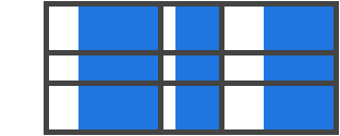
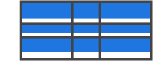
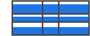
align-content
有时所有的 grid 的尺寸之后可能还是小于 grid container,这常发生在指定 grid items 的尺寸的时候,用的是 px 这样的固定单位。在这种情况下,可以设置 grid 在 grid container 里面的对齐方式。这个属性将 grid items 沿着块级轴(column)进行对齐(与 justify-content 相反,justify-content 是沿着内联轴(row)对齐)。
值:
- start - 将 grid 沿着 grid container 的起始边缘对齐
- end - 将 grid 沿着 grid container 的结束边缘对齐
- center - 将 grid 在 grid container 水平居中
- stretch - 调整 grid items 的大小让 grid 去填满 grid container 的宽度
- space-around - 在每个 grid item 旁设置偶数个空间,起始端和尾端的空间宽度为其他的半数
- space-between - 在每个 grid item 旁设置偶数个空间,起始端和尾端不留空间
- space-evenly - 在每个 grid item 旁设置偶数个空间,包括起始端和尾端
1 | .container { |
例子:
1 | .container { |
1 | .container { |
1 | .container { |
1 | .container { |
1 | .container { |
1 | .container { |
1 | .container { |
place-content
place-content 是同时设置 align-content 和 justify-content 属性的简写。
值:
- <align-content> / <justify-content> - 第一个值设置
align-content,第二个值设置justify-content,如果第二个值被省略,那么第一个值则同时作用于两个属性设置。
除了 Edge 之外的所有主流浏览器都支持 place-content 属性。
grid-auto-columns 和 grid-auto-rows
指定自动生成的 grid tracks 的尺寸(也就是稳式的 grid tracks)。当 grid items 比 cell 的数量多,或者一个 grid item 被放在了显式的 grid 外面,隐式的 tracks 就会产生。(参见The Difference Between Explicit and Implicit Grids)
值:
- <track-size> - 可以是长度,百分比或者
fr单元
1 | .container { |
想象一下隐式的 grid track 的产生:
1 | .container { |
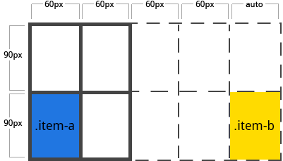
代码创建了一个 2x2 的 grid。
但是想象一下使用 grid-column 和 grid-row 来放置 grid items:
1 | .item-a { |
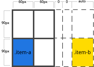
我们已经指定了 .item-b 从 line 5 开始,并且于 line 6 处结束,但是我们从来没有定义过 line 5 和 line 6。因为我们的参考线是不存在的,隐式的宽度为 0 的 tracks 就被创造出来去填充 gaps。我们可以用 grid-auto-columns 和 grid-auto-rows 去指定这些隐式 tracks 的宽度。
1 | .container { |
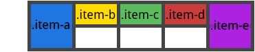
grid-auto-flow
如果并没有明确声明 grid 中的 grid items 的位置,那么自动安放算法就会生效从而自动排列 items。这个属性控制自动算法如何来生效。
值:
- row - 告诉自动算法轮流填充每一行,如果有需要就添加新行(默认值)
- column - 告诉自动算法轮流填充每一列,如果有需要就添加新列
- dense - 告诉自动算法 to attempt to fill in holes earlier in the grid if smaller items come up later
1 | .container { |
注意 dense 只是改变 items 视觉上的顺序,让它们乱序的出现,对易用性来说这是不好的。
例子:
1 | <section class="container"> |
定义一个两行五列的 grid,设置 grid-auto-flow 为 row(默认值):
1 | .container { |
把 items 放置在 grid 中后,只需要指定其中两个点:
1 | .item-a { |
因为已经设置了 grid-auto-flow 为 row,所以 grid 将会看起来像这样。要注意其中三个并没有被设置,所以它们沿着可用的行流动。
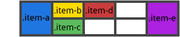
如果设置 grid-auto-flow 为 column,那么 item-b,item-c,item-d 就会沿着列流动。
1 | .container { |
grid
这是一个将 grid-template-rows,grid-template-columns,grid-template-areas,grid-auto-rows,grid-auto-column 和 grid-auto-flow 这些属性简写到一起的属性。(注意:只能对显式或隐式的 grid 使用单独声明来指定属性)
值:
- none - 设置所有的子属性为它们的初始值
- <grid-template> - 跟
grid-template这个简写方式相同 - <grid-template-rows> / [auto-flow && dense?] <grid-auto-column>? - 设置
grid-template-rows为指定的值。如果在斜杠的右边有auto-flow关键字,那么它会把grid-auto-flow设置为column。如果还加上了dense关键字,那么自动安置算法会使用“密集包装算法(dense packing algorithm)”。如果grid-auto-column被省略,它会被设置为auto。 - [auto-flow && dense?] <grid-auto-rows>? / <grid-template-columns> - 设置
grid-template-columns的值。如果auto-flow关键字被使用,那么grid-auto-flow会被设置为row。如果还加上了dense关键字,那么自动安置算法会使用“密集包装算法(dense packing algorithm)”。如果grid-auto-rows被省略,它会被设置为auto。
下面两块代码是等价的:
1 | .container { |
1 | .container { |
下面两块代码是等价的:
1 | .container: { |
1 | .container { |
下面两块代码是等价的:
1 | .container { |
1 | .container { |
下面两块代码是等价的:
1 | .container { |
1 | .container { |
它也可以使用更复杂但是更方便的语法一次设置好每项。可以指定 grid-template-areas,grid-template-rows,grid-template-columns 然后所有其他的子属性都会被设置为它们的初始值。要做的就是指定 line 名和 track 尺寸以及它们各自的 grid areas。例子如下:
1 | .container { |
上面的代码等价于:
1 | .container { |
用于 Grid Items 的属性(即子元素的属性)
注意:
float,display: inline-block,display: table-cell,vertical-align 和 column-* 这些属性对 grid item 没有作用。
grid-column-start / grid-column-end / grid-row-start / grid-row-end
用于确定在 grid 中的 grid items 相对于指定的 grid lines 的位置。grid-column-start / grid-row-start 是 item 开始的 line,而 grid-column-end / grid-row-end 是 item 结束的 line。
值:
- <line> - 可以是指代用数字编号的 grid line 的数字,或者是用命名指定的 grid line 的名字
- span <number> - item 会跨越指定数目的 grid tracks
- span <name> - item 会跨越至提供的名字的 line 处
- auto - 指示自动排列,自动跨越或者默认的一个跨度
1 | .item { |
例如:
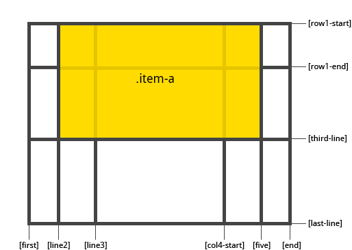
1 | .item-a { |
1 | .item-b { |
如果 grid-column-end / grid-row-end 没有被声明,那么 item 会默认跨越 1 个 track。
items 还可以相互重叠,可以使用 z-index 控制堆叠的顺序。
grid-column / grid-row
grid-column 是 grid-column-start + grid-column-end 的简写,grid-row 是 grid-row-start + grid-row-end 的简写。
值:
- <start-line> / <end-line> - 每一个都接受与非简写方式的属性值,包括跨度
1 | .item { |
例如:
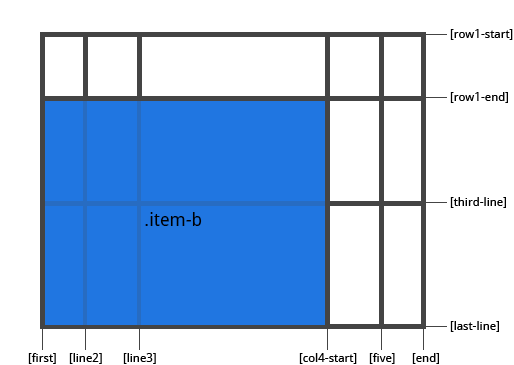
1 | .item-c { |
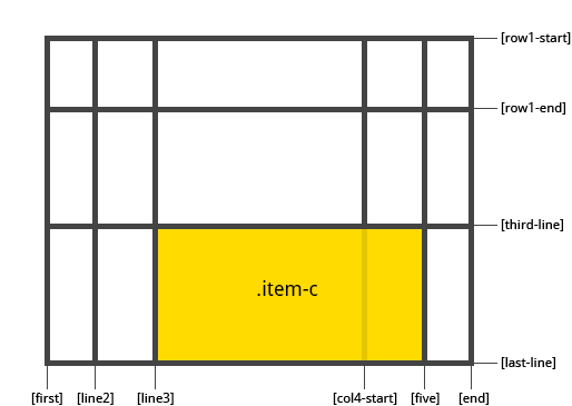
如果没有设置 end line 的值,那么 item 会默认跨越 1 个 track。
grid-area
给 item 命名,然后可以被 grid-template-area 引用。或者这个属性可以被用于更加简写的方式,由四个属性组成:grid-row-start + grid-column-start + grid-row-end + grid-column-end。
值:
- <name> - 取的名字
- <row-start> / <column-start> / <row-end> / <column-end> - 可以为数字,也可以为具名的 lines
1 | .item { |
例子:
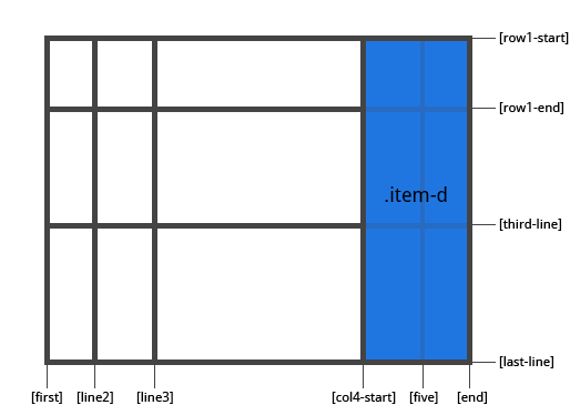
作为给 item 指派一个名字的方式:
1 | .item-d { |
作为以下四个属性的简写方式:grid-row-start + grid-column-start + grid-row-end + grid-column-end:
1 | .item-d { |
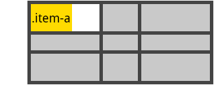
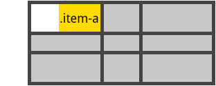
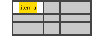
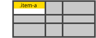
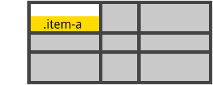
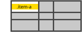
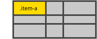
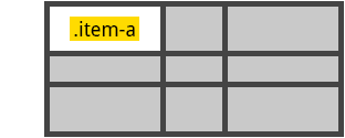
justify-self
将 cell 中的 grid item 沿着内联轴(row)对齐(与 align-self 相对,align-self 是沿块级轴(column)对齐)。这个属性只对单独一个的 cell 里面的 grid item 生效。
值:
- start - 将 grid item 与 cell 的起始边缘对齐
- end - 将 grid item 与 cell 的结束边缘对齐
- center - 将 grid item 在 cell 水平居中对齐
- stretch - 将 cell 的宽度填满(默认值)
1 | .item { |
例子:
1 | .item-a { |
1 | .item-a { |
1 | .item-a { |
1 | .item-a { |
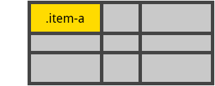
要为 grid 中所有的 items 设置水平对齐方式,使用 justify-items 对 grid container(父元素)进行设置。
align-self
将 cell 中的 grid item 沿着块级轴(column)对齐(与 justify-self 相对,justify-self 是沿内联轴(row)对齐)。这个属性只对单独一个的 cell 里面的 grid item 生效。
值:
- start - 将 grid item 与 cell 的起始边缘对齐
- end - 将 grid item 与 cell 的结束边缘对齐
- center - 将 grid item 在 cell 水平居中对齐
- stretch - 将 cell 的宽度填满(默认值)
1 | .item { |
例子:
1 | .item-a { |
1 | .item-a { |
1 | .item-a { |
1 | .item-a { |
要为 grid 中所有的 items 设置垂直对齐方式,使用 align-items 对 grid container(父元素)进行设置。
place-self
是同时设置 align-self 和 justify-self 属性的简写方式。
值:
- auto - 布局模式中的“默认”对齐方式
- <align-self> / <justify-self> - 第一个值设置
align-self,第二个值设置justify-self。如果第二个值被忽略,那么第一个值,同时作用于两个属性。
例子:
1 | .item-a { |
1 | .item-a { |
除 Edge 之外的所有主流浏览器都支持 place-self 这个简写属性。
支持的动画效果
参照 CSS Grid Layout Module Level 1 的规范,gird 属性中有 5 项是支持动画效果的:
grid-gap,grid-row-gap,grid-column-gap为长度,百分比,或 calc(计算值?)的时候grid-template-columns,grid-template-rows作为简单列表时的长度,百分比或者 calc(计算值?)的时候,而且区别之处只有列表里面的长度,百分比或者 calc(计算值?)